What Image Size and Format to Use for a Website

For most website images, resize to the largest size the image actually displays at (rarely more than 1920 pixels wide), save as WebP or a compressed JPG for photos and PNG only for graphics that need transparency, and keep the file under 200 KB wherever you can. That combination covers the vast majority of website images without a visible quality loss. The rest of this guide explains why those specific numbers, not just what they are.
Why website image size matters more than it looks like it should
Images are usually the heaviest part of a web page by a wide margin, often more of the total download than every other file on the page combined. A page that loads slowly loses visitors before they see it, and search engines measure load speed directly as a ranking factor. Fixing image size is one of the few web performance changes that costs nothing and breaks nothing: the picture looks the same, the file is just smaller.
The two levers that matter are pixel dimensions and compression. Pixel dimensions control how much raw data the image contains before any compression happens; compression controls how efficiently that data gets packed into a file. Most oversized website images have both problems at once: a phone photo shot at 4000 pixels wide, displayed on a page at 800 pixels wide, saved at full quality.
What pixel size actually to use
Resize to the largest size the image will actually display at on the page, not the size the camera or design tool handed you. A full width hero image on a typical desktop layout rarely needs to be wider than 1920 pixels; a blog post's inline photo rarely needs more than 1200; a thumbnail needs a few hundred at most. Uploading a 4000 pixel wide photo for a 600 pixel wide thumbnail wastes most of the download on detail nobody's screen will ever render.
If the same image needs to look sharp on both a phone and a large monitor, size it for the largest display it will realistically appear at, since a browser can always scale an image down to fit a smaller space, but it cannot add detail back in if the source was too small to begin with.
Which format to actually pick
For a photo, use WebP if the site's audience is on a reasonably current browser (which covers almost everyone by 2026), or a compressed JPG as the safe fallback. Both use lossy compression built specifically for photographic detail, and WebP at an equivalent visual quality is usually meaningfully smaller than JPG for the same image. For a graphic that needs a transparent background, a logo, an icon or flat colour illustration, use PNG, or WebP's own lossless mode if the site already commits to WebP everywhere.
Do not save a photo as PNG. PNG is lossless, which is the wrong tool for a photograph's smooth gradients and thousands of subtle colour shades: the file ends up several times larger than the same photo saved as JPG or WebP, for no visible benefit, since a photo was never going to be pixel perfect on a screen anyway.
A realistic file size target
There is no single correct number, since a full width hero image and a small thumbnail have very different reasonable sizes, but a useful rule of thumb for an inline content photo is to keep it under 200 KB, and under 500 KB for a large hero image, before it starts noticeably dragging on page load, especially for a visitor on a mobile connection. If a page has a dozen images anywhere near a megabyte each, that page is carrying tens of megabytes before a single word of content downloads.
- Resize to the image's actual display size on the page, not the camera's original size.
- Photos: WebP first choice, compressed JPG as the fallback. Never PNG for a photo.
- Graphics with transparency: PNG, or WebP's lossless mode.
- Target under 200 KB for an inline image, under 500 KB for a full width hero image.
- Batch process: resize once, then compress, rather than eyeballing quality on every single upload.
Serving a different size to phones and desktops
A single fixed size image is a compromise: big enough to look sharp on a desktop monitor, which wastes bandwidth on a phone that displays it at half the width. Modern HTML supports a srcset attribute that lets a browser choose between several versions of the same image based on the visitor's actual screen size, downloading only the one it needs. Setting this up means preparing two or three sizes of the same image, commonly something like 800, 1200 and 1920 pixels wide for a hero image, which the Image Resizer produces quickly since the same crop and framing carry over between sizes, just the pixel dimensions change.
This matters most for the images visible without scrolling, since those delay how quickly a page feels loaded. Images further down a page benefit more from lazy loading, where the browser only downloads them once a visitor scrolls close enough to see them, which most current browsers now support natively with a single HTML attribute and needs no extra image preparation at all.
The mistake that undoes all of this
The most common way a well optimised image gets undone is uploading it somewhere that recompresses it again on top of the work already done, a content management system, a social platform share preview, or a page builder's own image handling, each applying its own compression pass. A JPG that was already carefully compressed once loses a little more detail every time it gets recompressed, called generation loss, so a file that looks fine locally can come out visibly softer once it has passed through two or three automatic recompression steps elsewhere. Where possible, upload the highest reasonable quality version and let a single system handle compression once, rather than pre-compressing hard and letting something else compress it again.
Doing all of this without leaving the browser
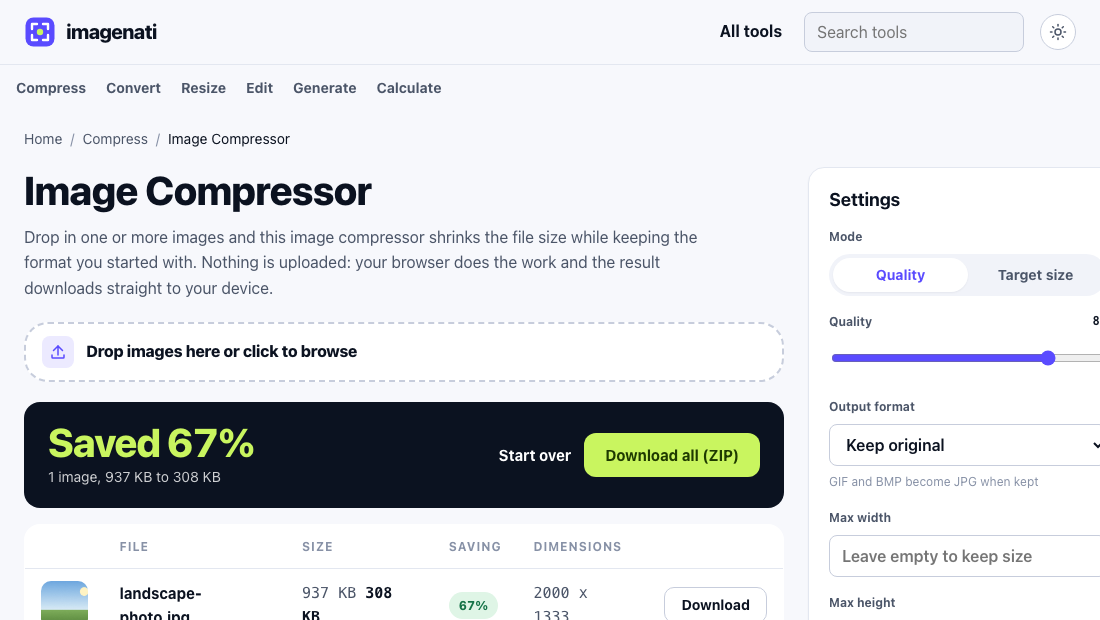
The Image Resizer changes the pixel dimensions to the size a page actually needs. The Image Compressor then handles the file size, with a quality slider or a target size in kilobytes if a specific limit matters more than a specific quality. The Image Converter switches format when the source file came in as the wrong one, such as a PNG screenshot of a photo that would shrink dramatically as a JPG instead. All three run entirely in the browser, so a batch of website images never has to leave the device to get resized, compressed and converted.