How to Make a Favicon That Looks Sharp on Every Device

A sharp favicon starts with a simple design, one shape or one or two letters, high contrast between the mark and its background, and enough padding that nothing touches the edge of the frame. Most favicons that look blurry or unreadable do not have a technical problem; they have a design problem, usually too much detail crammed into a space that is sometimes displayed at only 16 pixels wide, smaller than most letters in this sentence. The rest of this guide covers why that happens and how to design around it.
Why 16 pixels is the size that actually matters
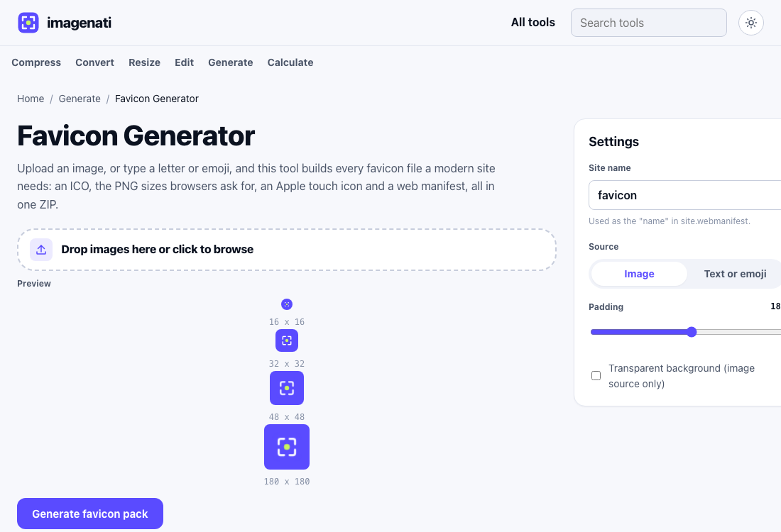
A favicon appears in a lot of places: a browser tab, a bookmark list, a browser history entry, a search result, a home screen icon. Most of those spots show it small, and the browser tab specifically is often only 16 by 16 pixels, smaller than a typical emoji rendered in a chat app. A logo with fine detail, a gradient, or more than two or three colours tends to collapse into an unreadable smudge at that size, even though the same logo looks perfectly fine at 128 or 512 pixels. Designing for the smallest size first, then checking it still looks fine larger, produces a better result than designing large and hoping it survives shrinking.
What actually holds up at small sizes
- One shape, or one or two letters. A full wordmark or a detailed illustration is the most common reason a favicon fails at 16 pixels.
- High contrast between the mark and its background. Two similar shades next to each other disappear at small sizes even if they look fine large.
- Padding around the edges. A mark that touches the frame's edge tends to look cramped or gets clipped slightly depending on the platform.
- Bold, simple strokes rather than fine detail. Thin lines are the first thing to disappear when an image shrinks.
If there is no logo yet
A finished logo is not a requirement for a good favicon. A single letter, usually the first letter of the site or brand name, set on a solid background colour, reads clearly at every size and is exactly what a lot of well known sites actually use rather than a shrunk version of their full logo. An emoji works the same way for a more casual or playful site. Both avoid the most common failure mode entirely, since there is no fine detail to lose in the first place.
Why a favicon needs so many different files
Every place a favicon appears expects a different file: a browser tab commonly uses a 16 or 32 pixel icon from a favicon.ico file, an iPhone home screen shortcut uses a 180 pixel Apple touch icon, and an Android home screen or an installed web app uses larger 192 and 512 pixel PNGs listed in a manifest file. Supplying only one size means every other surface has to stretch or shrink that one image to fit, usually with worse results than a size built specifically for that use. Generating the full set together, rather than one image resized by hand for each use, is the difference between a favicon that looks intentional everywhere and one that looks fine only in the one spot it was actually designed for.
Colour choices that actually help
Browser tabs, bookmark bars and home screens appear in both a light and a dark interface theme depending on the visitor's own device settings, so a favicon that relies on a white or near white background can effectively disappear against a light browser theme, and the reverse for a dark mark on a dark theme. A solid, saturated background colour behind the mark, rather than leaving it transparent or white, keeps the icon visible and recognisable against either theme, which matters more for a favicon than it would for a logo used elsewhere on a page with a background you control.
Checking it actually worked
The most reliable check is the simplest one: open the site in a real browser tab, bookmark it, and look at both at actual size rather than zoomed in, since a favicon that looks fine zoomed in at 400 percent can still be unreadable at its real 16 pixel size. Adding the site to a phone's home screen tests the Apple touch icon and the Android manifest icons the same way. A favicon that survives all of these small, real world checks is far more telling than how it looks in an editor at a large preview size.
A note on starting from an existing logo
Building a favicon pack from an existing logo image works well when that logo is already fairly simple, but a source image with a lot of fine detail rasterised at a small declared size can come out softer than expected once scaled up to the larger 192 or 512 pixel sizes a modern favicon pack needs, since there is a limit to how much a small source image can be enlarged before it visibly softens. A source image that is already reasonably large, ideally at least as large as the biggest size in the favicon pack, avoids this; a tiny source image stretched up to fill a 512 pixel icon rarely looks as crisp as one that started large enough to begin with.
From ZIP to live site
The Favicon Generator produces a single ZIP with every file a modern site needs, an ICO for older browsers, the PNG sizes current browsers ask for, an Apple touch icon and a manifest file, plus the exact link tags to paste into a page's head section. If only a working ICO file is needed rather than the full pack, the ICO Converter handles that in a simpler mode using the same underlying engine, for a case where a full favicon pack already exists elsewhere and just one working ICO file is missing.